Building a voice interface for a spoken word platform
UX DESIGN DIRECTOR
Objective
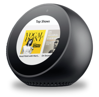
In August 2019, my team and I were commisioned to build the voice app for the podcast-streaming startup Luminary, "The Netflix of Podcasts".
We aimed to make this the most natural surface for their product, a voice interface for a voice product.
The main objective was enabling frictionless consumption of media, providing a seamless experience between any kind of device.
Results
We created the first Alexa Skill to offer seamless subscriptions across devices and surfaces. Ubiquity, from smart headphones to home stereo.
Impact
Hundreds of new subscribers within the first few hours of being live. Picked up by media outlets, and featured by Amazon.
Context
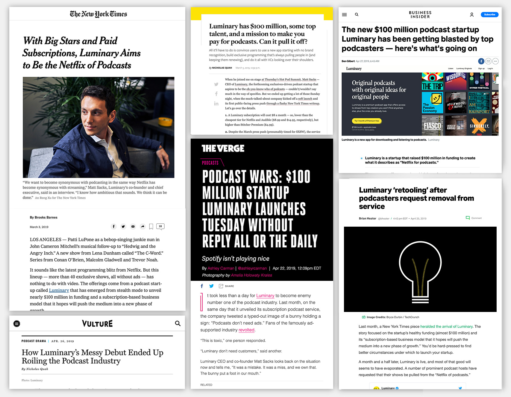
In the summer of 2019, Luminary had raised $100,000,000 (one hundred million dollars) to spend on their product. Their value prop message was bold:
"Podcast's shouldnt have ads"
They started capturing big names within the podcast industry, but suffered a quick backlash. Top podcasts widthdrew from their platform.
Hard headlines rolled... and stakes were at an all time high. Luminary needed to prove their subscription value.
We were asked to take Luminary everywhere. From smart-headphones, the car, to home echo devices.
Make Luminary ubiquitous.
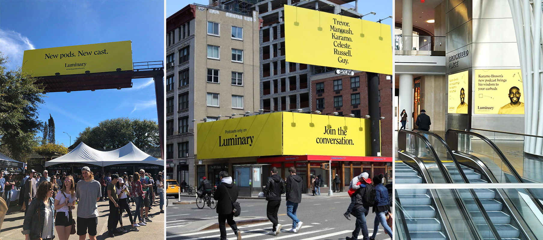
Summer 2019, NY and Chicago
Designing the Process
Because of the size and scope of the project, we needed some serious thinking behind our tooling and Design Process.
As the design director in charge, I outlined the following apporach conversational design for products.
Research & Alignment
We talked with several users and podcasters, and reviewed the documents that Luminary had already produced about their users.
We took a deep dive on the Alexa Skill Store and the actions for Google Assistant, as a form of "competitive landscape research".
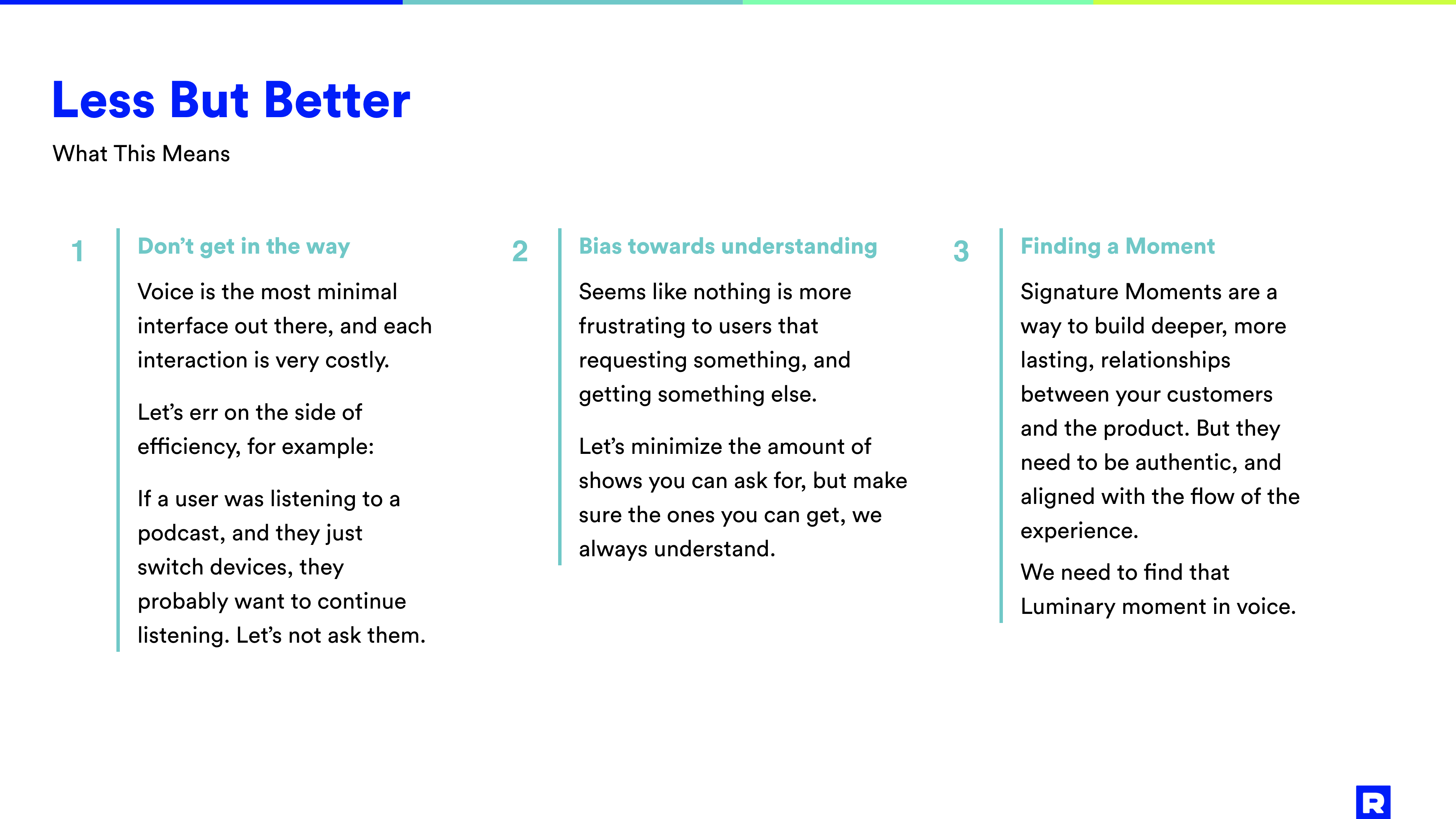
All of this was compiled on a presentation with the different insights, and what would become our guiding POV:
"Less But Better"
User Scenarios
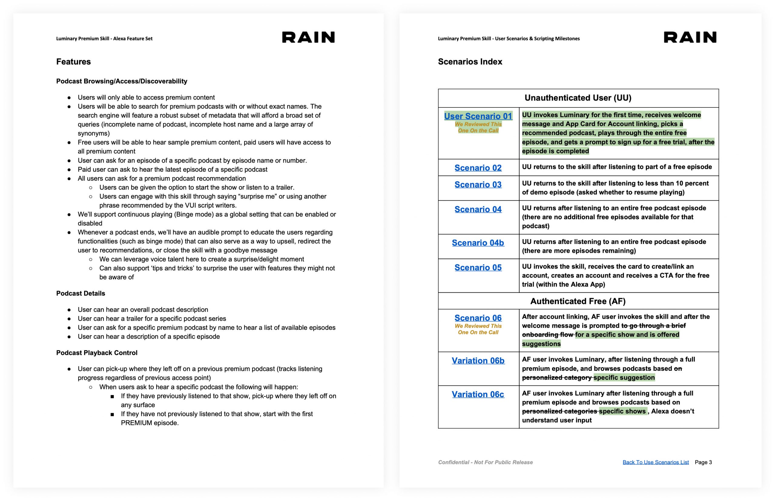
During this step we map the different user needs with product states.
This is how we flesh out how each feature works, and how the user navigates between them.
This is not a very sexy document, but it's crucial to align on this early in order to move ahead.

We then plot these scenarios on an emerging user journey chart, that helps us evidence holes, and areas of opportunities.
Milestones and Scripts
After aligning with the client on the product states, we create scripts for each one of these situations.
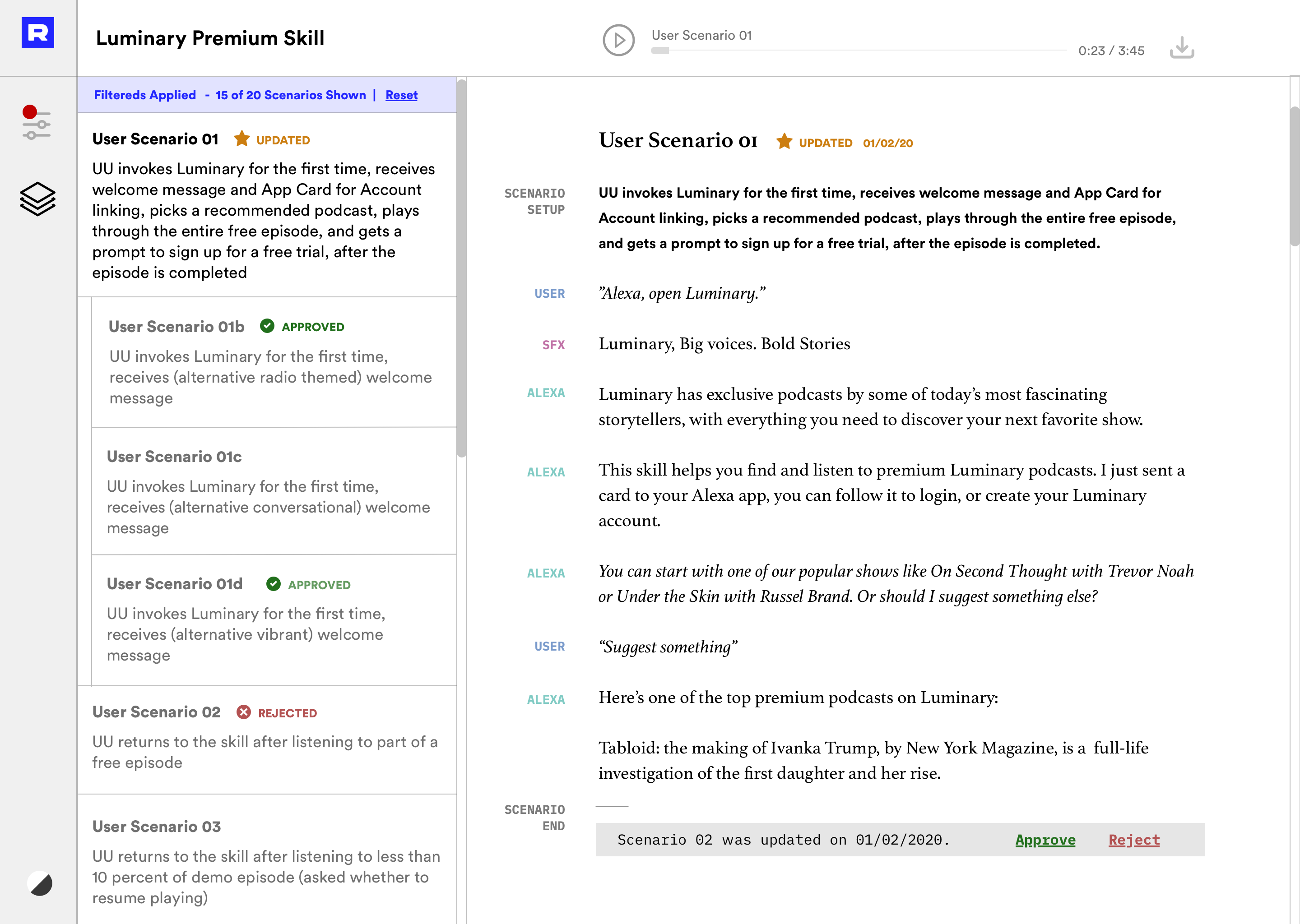
These Script documents can be hard to keep track of, in relation to their corresponding states, so after several iterations, I rallied the dev troops and got approval to build a (very minimal) tool to share scripts with the client.
With this custom UI you can hear the scripts (instead of reading), which is a much more faithful experience.
Wireframes and Hi-Fi
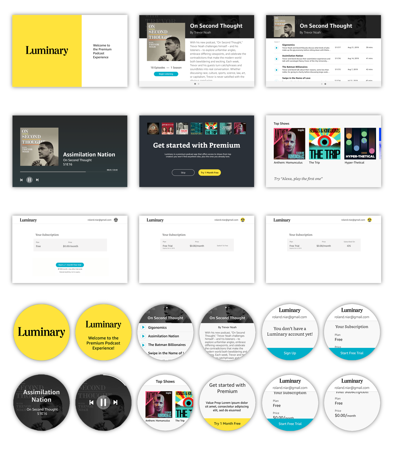
Amazon Echo devices have many constraints when it comes to visual design:
- Two default fonts
- Stringent weight limits
- Some screens have a mandatory template
We embraced contraints, and followed the luminary app style to make the best of it.
State Machine Diagram &
Voice User Interface (VUI)
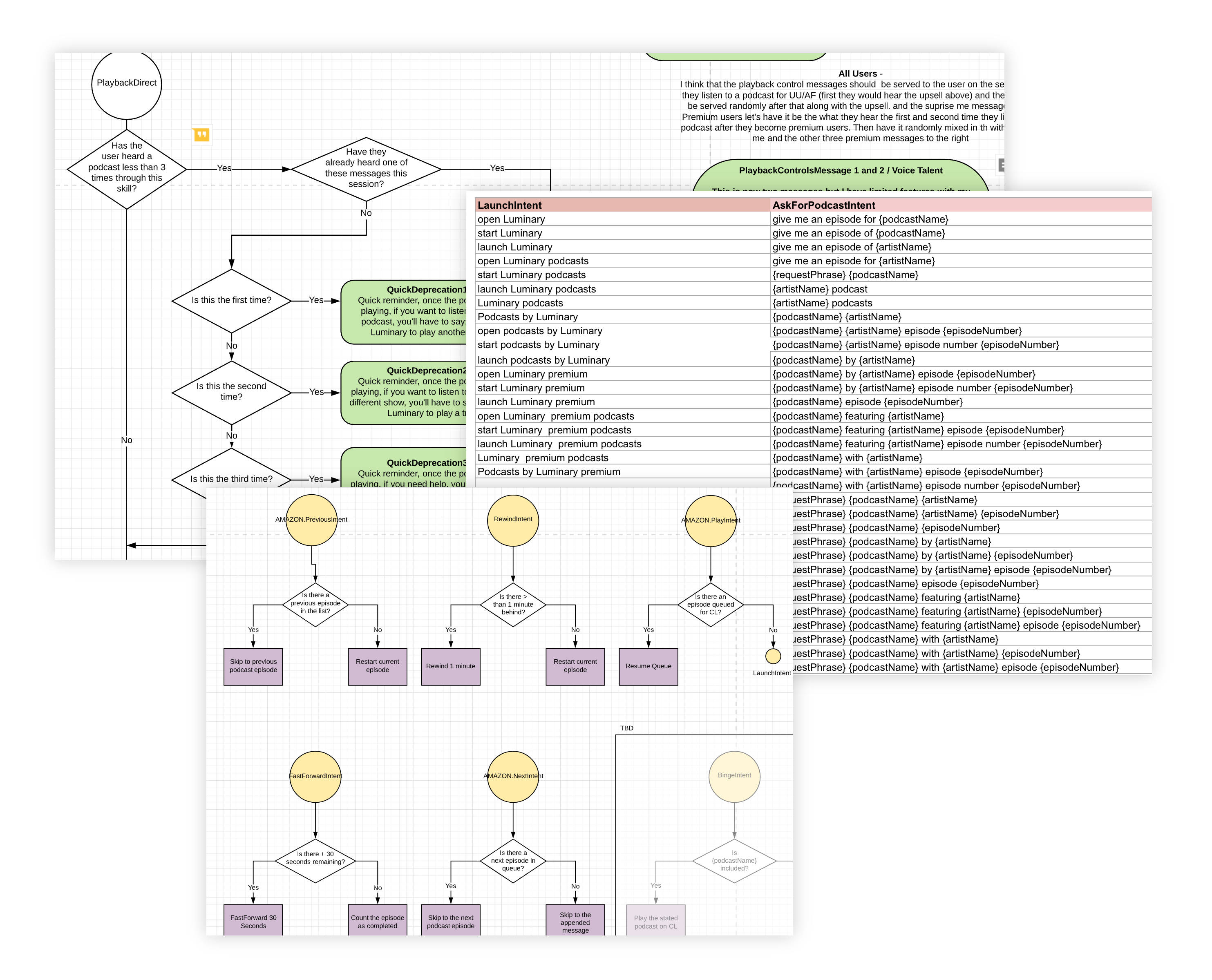
The following step is the production of the technical documentation that instructs how everything connects, how the logic works, and what would be the response to each interaction on every state.
This is where most voice designers begin their process, as most don't write scripts, or think about the states as contextual and interrelated, but as a lineal progressions.
Establishing Metrics
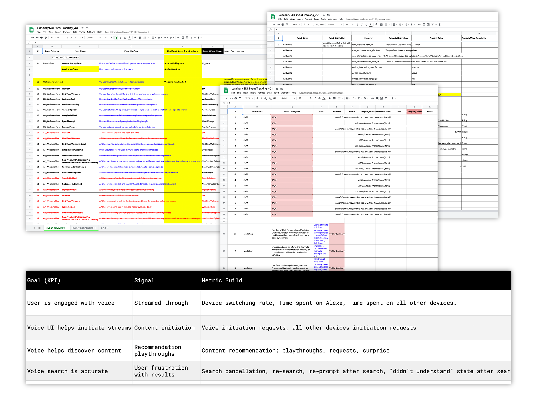
The very last step before development was aligning and tagging all the basic events and properties, and how the funneled into KPI's.
There was a lot of back and forth with the different members of the team, all the way to our client's CFO. The key to this process was transparency and accuracy.
We used mParticle, which is very different to Google Analytics, and this implied a slight learning curve for the whole team, and was an exercise in applying constraints, and thinking how to best shape more abstract KPI's.
The following image shows some of the documents we used to socialize the different metrics and KPI's
The Product
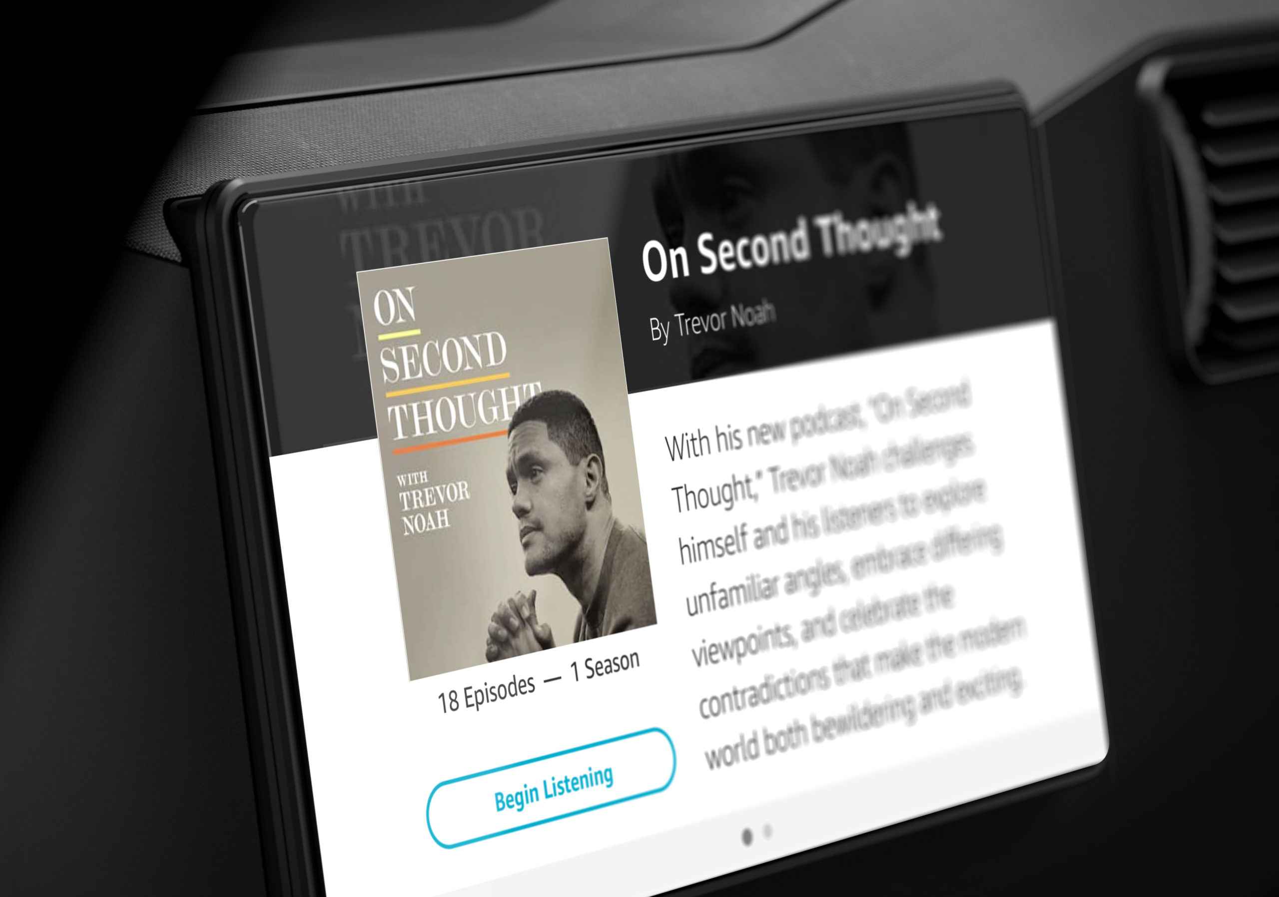
Seamless from Car to Headphones
- Several hundred new subscribers acquired in the first few hours of going live
- User engagement with the Luminary platform in general increased 34%
- 5-Star Rating in the Amazon Skill Store
- First skill to offer subscriptions via voice in the Alexa ecosystem
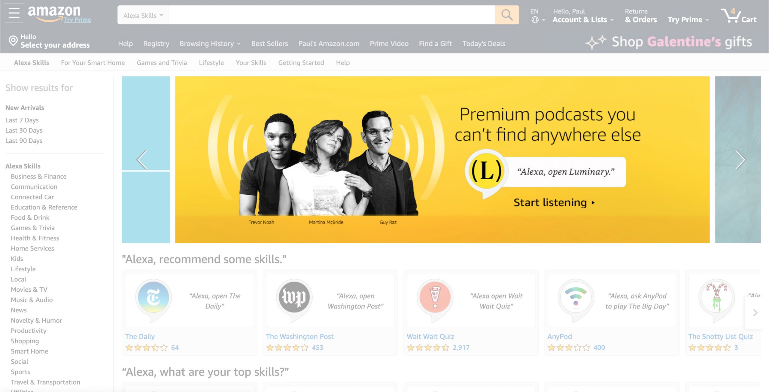
Featured Alexa Skill
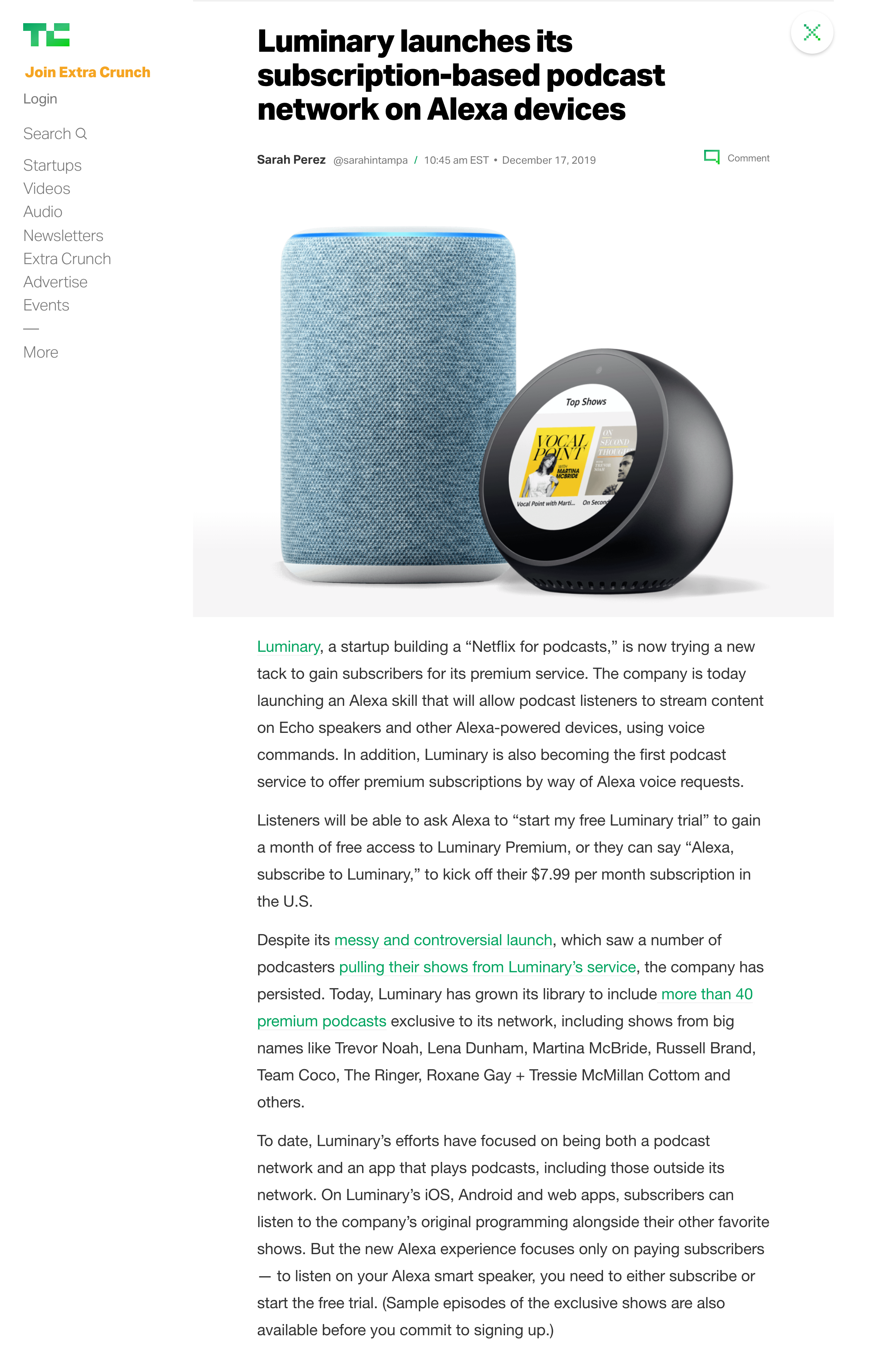
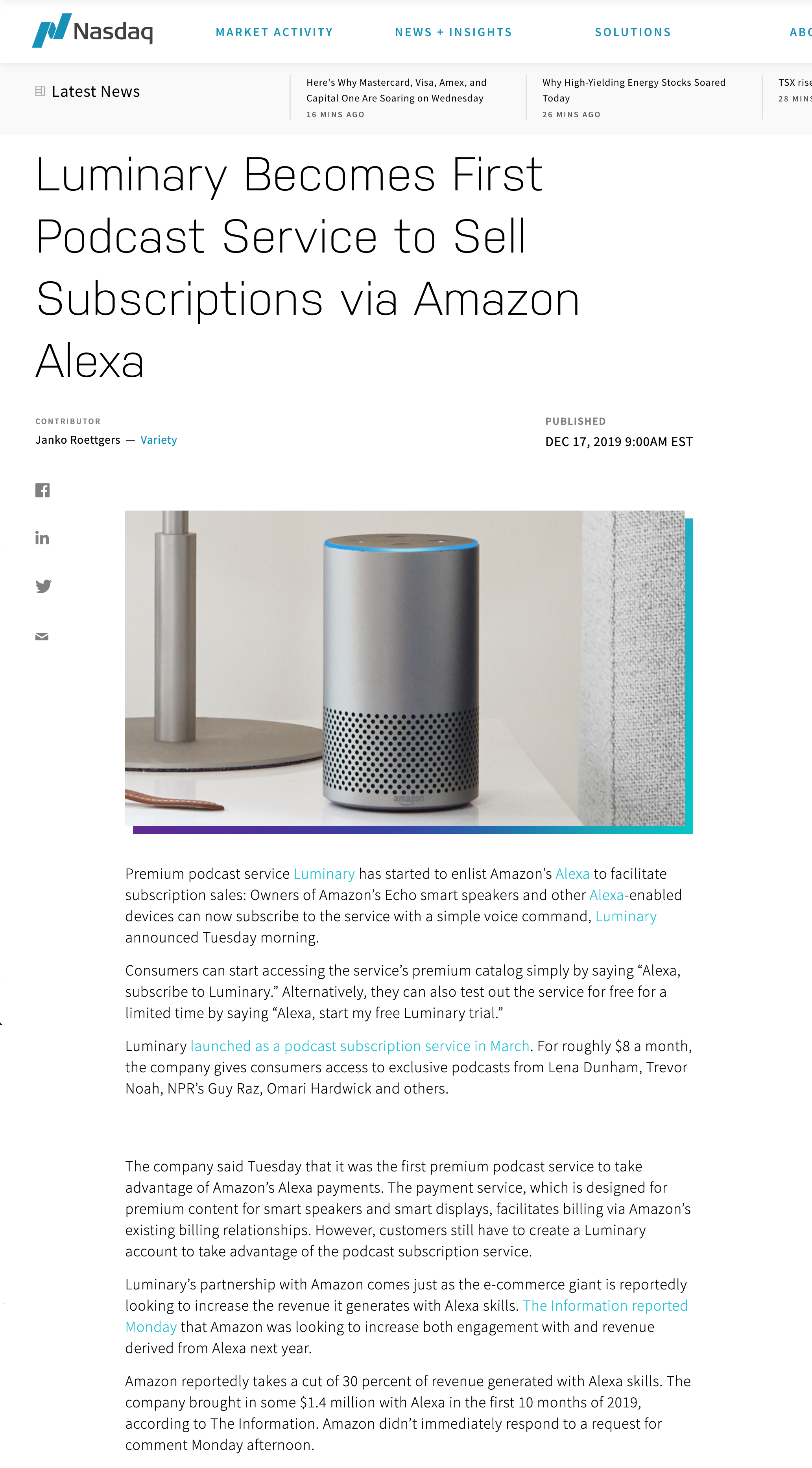
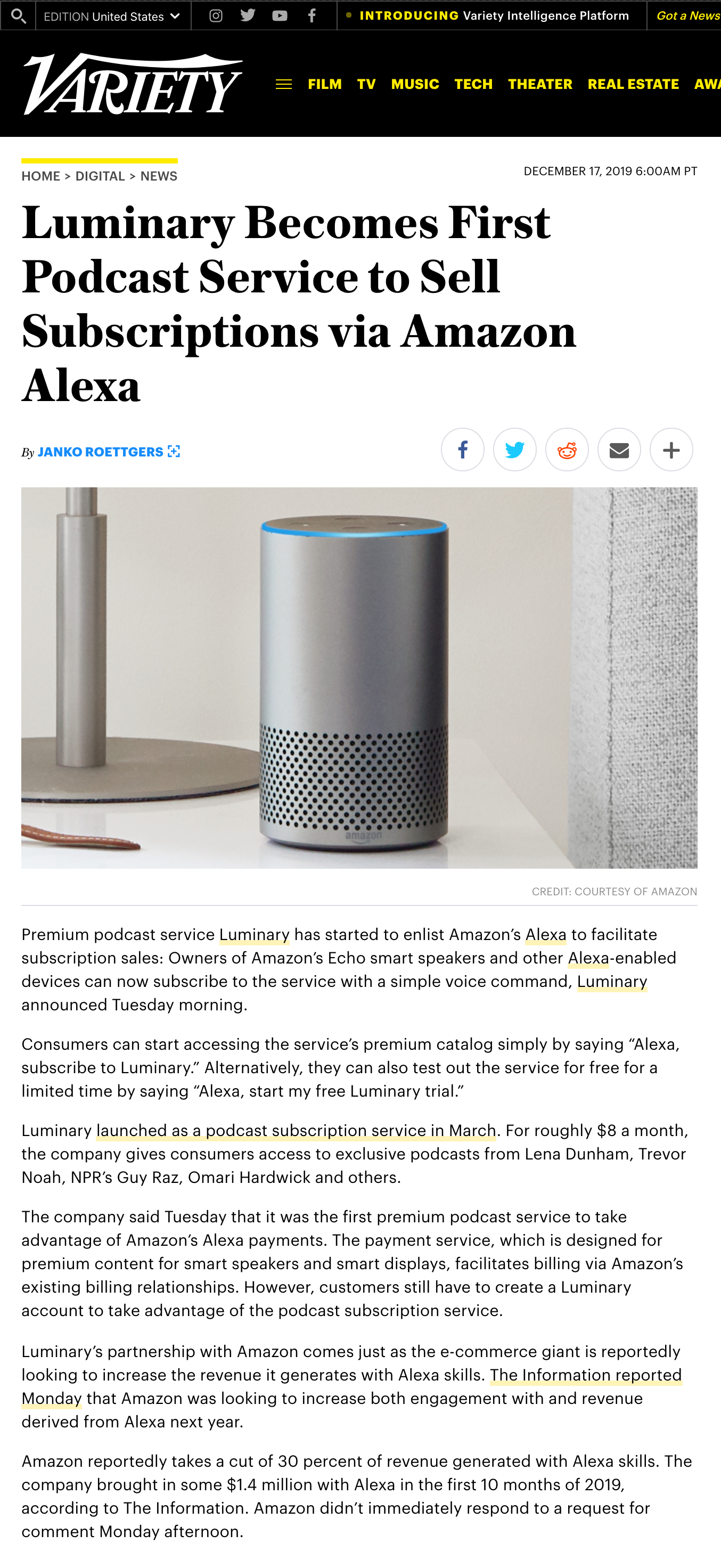
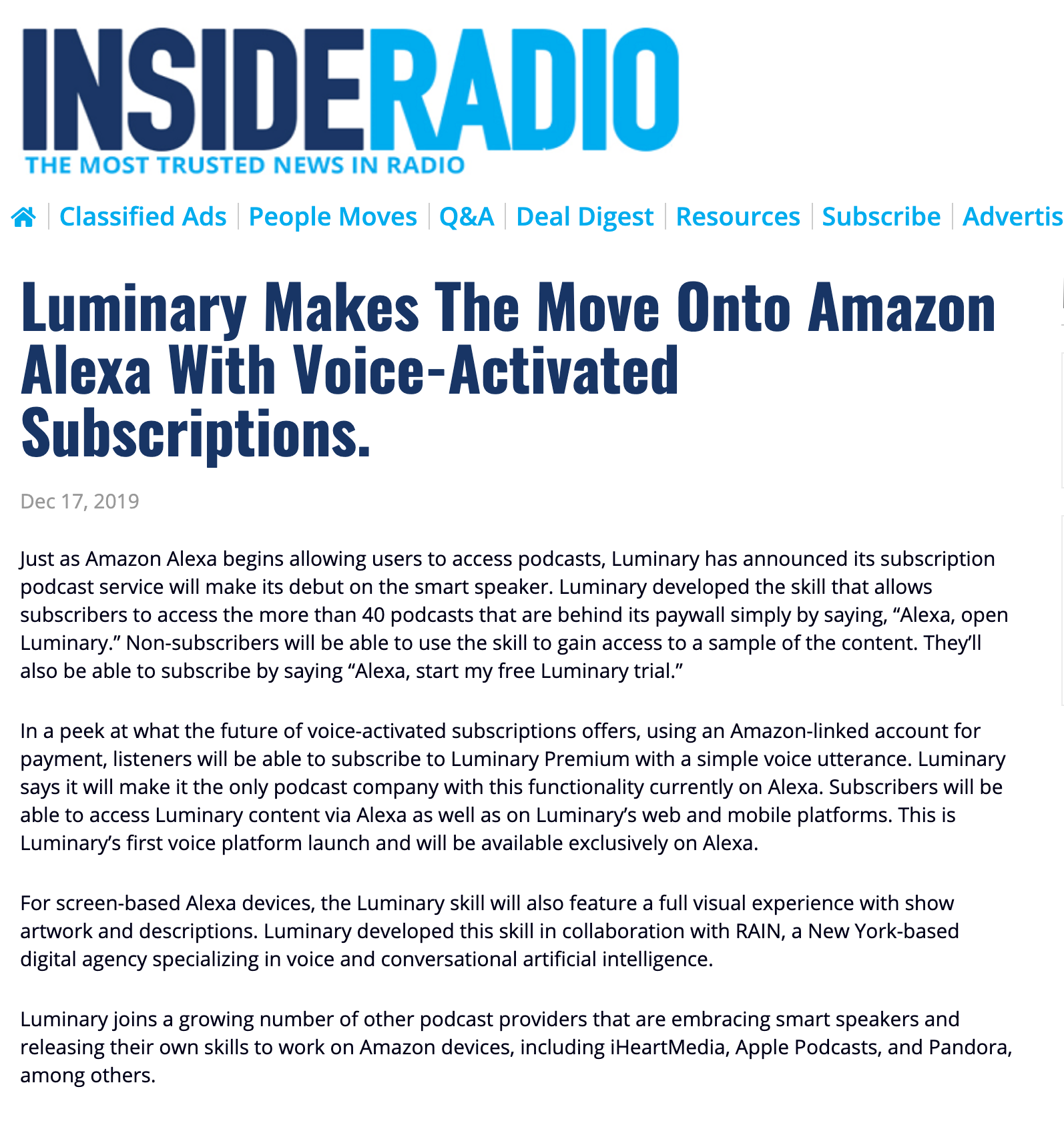
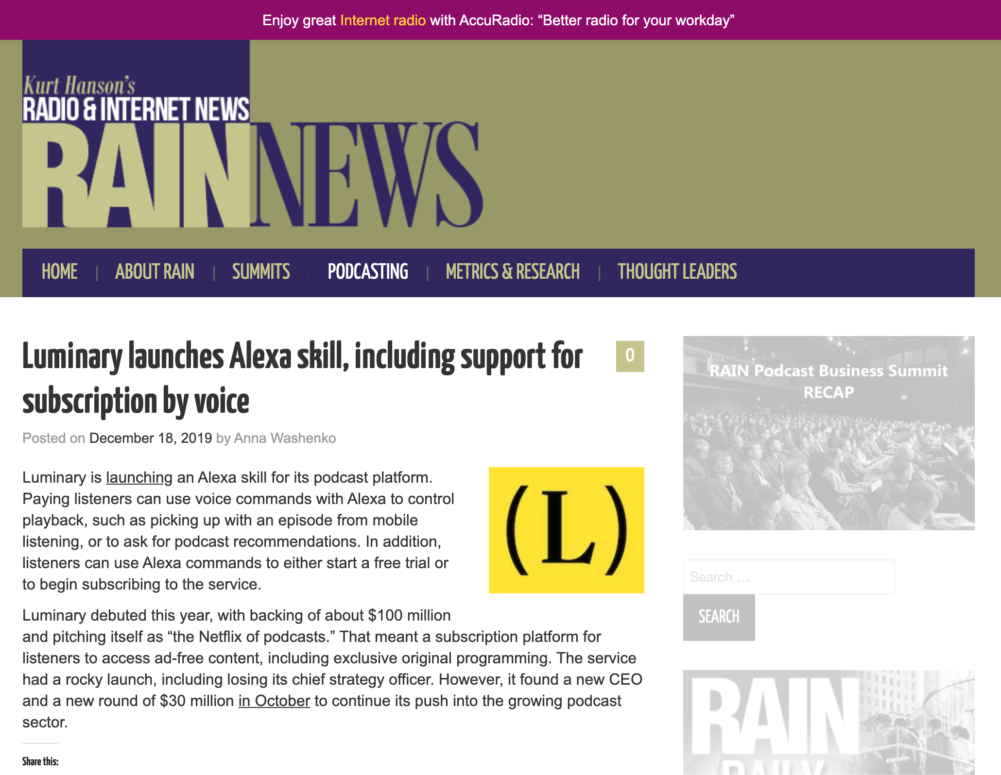
Picked up by Media
Tech Crunch
Nasdaq
Variety
Podcast industry specific Media
Some Learnings
- Don't be afraid of changing the process
- Think big, start small
- Cooperation over hierarchy
- Include everyone (even client) in daily's
Our Team
- Yarden Abukasis, PM
- Paul Zumbrink, Design Director
- Lauren Madsen, Skill Designer
- Shanna Walia, Strategy Analyst
To comply with my non-disclosure agreement, I have omitted and obfuscated confidential information in this case study.
All information in this case study is my own and does not necessarily reflect the views of RAIN or Luminary.
© 2020 Paul Zumbrink. All rights reserved